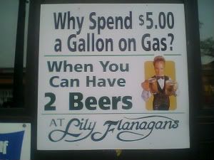
drink, don't drive.
7.31.2008


7.30.2008
hate hate: keira knightley. & boobs.
 alright, i don't hate boobs. but i do hate keira knightley. her poor excuse, stoic, mouth-acting has ruined every single period piece film for the past half a decade (i won't get into star wars or pirates). and the only historic one she didn't corrupt was overrun with her twin natalie portman.
but, as Adrants has pointed out, keira did something maybe kinda halfway decent (arguably for the first time). she declined post-production touch-ups to enhance her breasts for the collateral on the new movie The Duchess. and you know what? i'm more than okay with that. dare i say i wish other actresses would follow suit.
it's nice for someone to make a stand like that and say, my body is good the way it is. kudos to keira for that. the real thing is, though, i wonder how many magazines are going to cover this information, or is it just going to be an afterthought (somewhere after the thought 'did she get a breast reduction?'). i recognize it's all over google and the celeb dish blogs, but i'm talking about the kids.
i would love for a girls' magazine to cover this, interview her, and let her be that role model. i want to see it in Elle Girl, in CosmoGirl, in Seventeen, in YM. disappointing to just have it fall by the wayside, covered by us folks intrigued by advertising and photoshop, and not the folks who should be sending the message.
travel destination: LIRR, Westin.
 so, coming home from a yummy sushi dinner at Azuki last night (if you like sushi, do it up; they're 520 8th ave), i got to staring (as i always do) at the often inane ad posters on the inside of the LIRR trains.
now to begin with, i find these sort of things often funny. frequently the same ad goes up, in the same entrance/exit car, facing each other. as if you didn't get the point on your left, you may need it mirrored on the right. regardless.
this is actually about a train ad i like--mostly.
Westin has been doing some halfway decent advertising in the past year, really breaking the clutter from competitor hotel advertisements by using the age old trick of not showing what you're selling. these train ads, i presume, are part of that campaign. they are really high quality nature images with one phrase of copy and the logo. that's it. if anyone can find a shot of these, let me know--i looked.
they caught my eye because they were nice to see on a dreary train. the copy was even clever. one was a shot of an immense tidal wave and the words "rush hour." another had incredibly tall trees and the word "skyscrapers." another was a shot of para sailing, from the feet down with the ocean, and the words "middle seat." the message was relevant and acute.
there was only one problem ad in the campaign. a pristine shot of a path through the woods. the phrase? "avoid the traffic." this breaks the noun trend they've been using. moreover, it lost relevance. we're on a bloody train. relate to the train, not the car i'm not in. a better phrase? "public transportation."
has anyone else seen these ads elsewhere? what did you think?
7.28.2008
just cuil off--premature race entry.
 the response to Cuil, the recently launched "competitive" search engine to rival Google, has been wholeheartedly underwhelming. you can see everyone's under-enthusiasm in a little stream compliments of twitter. Cuil is pronounced "cool"--but a word to the wise. be careful with this ridiculous name: don't misspell it, at least not at work.
Cuil was formed by ex-Google employees in a hope to give Google a run for its money. basically, it's got a pretty neat interface. it looks fun. which is important. "remember that the search occasion isn't just mandatory, it's also fun!"
but anyway. integrating images into the search results are pretty cool and somewhat reminiscent of StumbleUpon--with one downside: the pictures aren't right.
the results are fewer, despite Cuil sporting a "wider scope" of tracked pages, and the results are also irrelevant. if i search for me, i don't even get this blog. i get a laundry list of "buzzter" records. no profiles, nothing. it is hard to find me, even if you're looking directly for me. this problem is across the board, it seems, and not just with my branding.
there are also many complaints about its slow load time, in addition to its irrelevance and image errors. so basically, the take home message is, Cuil is very... pretty. otherwise, currently useless. holds a lot of promise, but for it being a few years in the works, its launch into the seo race seems largely premature. it's leaving a bad first impression, but people seem open to possibilities.
perhaps take it back into the Batcave and emerge with some better technology--the costume is just fine. my questions to you:
how important are the longer text blocks and the images to you? do you prefer the 2-or-3 column look, or are you more comfortable with the Google-style laundry list of results? how do you say it? i just can't say "cool." i wind up with that ridiculous teen word in my head, "kewl," like kyool, whenever i see the word Cuil.
another epic fail used to totally win at branding.
friendly warning: before you hit play, make sure your volume is at a reasonably low level.
similar to how twitter followers have embraced the Fail Whale, Croc (shoes i hate) are capitalizing on that hatred in an endearing fashion. [i caught this commercial at some point on G4 while watching the Heroes seasons 2 marathon saturday, when i should have been swimming.]
this commercial worked for me because i do really, really bloody hate them. hate hate. Crocs knows this. they know that we hate them. they also know that no amount of advertising is going to make me want to purchase a pair [due to said undying hatred]--but, they did improve their communications, in my eyes, for recognizing and using this to their advantage in a funny way that i can relate to, even as a non-Crocs wearer; moreover, it creates this rebellious subculture among those who do wear them. Yeah, We Wear Those Shoes You Hate. And Eff You, Too.
where it doesn't gain, it reinforces.
it is that culture around a brand--it's accomplishments as well as its shortcomings--that help to make the brand an integral part of your life. when the brand isn't just a word, or a product, but a personal statement. congrats on Crocs achieving a piece of that with this commercial.
7.25.2008
Rush epic fails at playing... Rush.
courtesy of @ischafer, this pretty much sums it up, but i had to share:
you can watch Rush fail at playing their own song, Tom Sawyer, on Expert in Rock Band here, courtesy of Laughing Squid.
[note: i'm not surprised. all my musically inclined friends tell me that all Rock Band/Guitar Hero do is teach you to miss, and thus fail. doesn't stop me from playing anyway! still, this gesture is really awesome, and fun to geek out to. kudos to Rush.]
friday felines part 3: riblet, cosplay, sharks.
 as always promised, here i go, distracting your fridays with.... felines!
first order of business: Riblet.
"Bird loathing works up a powerful hunger." -- Riblet.
if you ever wanted to read a twitter feed consisting mainly of a cat discussing its food bowl, @riblet is for you. OK, so you may ask yourself, who the fuck cares? and you'd be right, because i asked myself the same damn thing. except for, it turns out to be awesome. see why here. be curious, support the "gray cat agenda."
second order of business: catgirls.
okay, not really catgirls. it's the inversion of cosplay. rather than girls dressing up as cats, this (Japanese) site encourages cats dressing up as girls. or samurai. or robin hood. or a corn doll. don't ask. just go. get a good giggle. and then feel pity for that very, very patient feline who didn't tear out his or her owner's eyes during that photoshoot.
last order of business: sharks.
bad photoshop, but still, some creepy merit a la sharkweek (when was that anyway?).
previous friday feline installments: (1: kitten wars, 2: zombie cats)
Subscribe to:
Posts (Atom)